Creating a home that feels calm, intentional, and visually unified is one of the most rewarding things you can do for your living space. Whether you are furnishing a new apartment in Dubai or refreshing a villa in Abu Dhabi, building a cohesive home decor palette is the foundation of elegant interior design. This guide walks you through the key principles — from choosing your base colours to layering textures and selecting accent pieces that tie everything together.
What Is a Home Decor Palette?
A home decor palette is the curated set of colours, materials, and textures that define the visual identity of your interior. Think of it as the design language your home speaks. A well-chosen palette creates harmony between furniture, soft furnishings, decorative objects, and architectural elements — so that every room feels like it belongs to the same story.
In the UAE context, where natural light is abundant and interiors often blend contemporary minimalism with warm cultural influences, a thoughtful palette can make spaces feel both modern and deeply personal.
Step 1: Start with a Neutral Base
Every cohesive palette begins with a neutral foundation. Neutrals anchor the space and give your eye somewhere to rest. Popular choices for UAE homes include warm whites, soft sand tones, greige (grey-beige), and muted terracotta — all of which complement the natural light and architectural materials common in the region.
Your neutral base should appear on your largest surfaces: walls, flooring, and major upholstered pieces. Once this is established, everything else layers on top.
Choosing the Right Neutral
Not all neutrals are equal. A cool grey will create a very different mood from a warm ivory. Hold paint swatches or fabric samples against your existing flooring and observe them at different times of day. In Dubai's intense afternoon light, warm neutrals tend to glow beautifully, while cooler tones can feel crisp and contemporary in the evening.
Step 2: Select Two or Three Accent Colours
Once your neutral base is set, introduce two or three accent colours that will recur throughout the space. These do not need to be bold — in fact, muted, earthy accents often feel more sophisticated and are easier to live with long-term.
A reliable approach is the 60-30-10 rule: 60% neutral base, 30% secondary colour (perhaps a soft sage, dusty rose, or warm olive), and 10% a stronger accent (deep navy, burnt sienna, or antique gold). This ratio creates visual interest without overwhelming the senses.
Carry your accent colours across different rooms and object types. A sage green that appears in a ceramic vase in the living room might echo in a cushion in the bedroom — this repetition is what creates cohesion.
Step 3: Layer Textures and Materials
Colour alone does not make a palette feel rich. Texture is what gives a room depth and warmth. In a cohesive interior, you want a mix of hard and soft, matte and reflective, rough and smooth.
Materials That Work Well Together
Some material combinations that feel naturally harmonious in contemporary UAE interiors include linen and rattan, marble and brushed brass, raw wood and woven cotton, and ceramic and glass. The key is to vary the texture while keeping the colour palette consistent.
For example, a living room in warm neutrals might feature a linen sofa, a rattan side table, a marble tray, and a set of matte ceramic vases — all in tones of cream, sand, and warm white. The variety of materials keeps the eye engaged, while the unified colour story keeps the space feeling calm.
Step 4: Bring in Decorative Accents Thoughtfully
Decorative objects are where your palette comes to life. These are the pieces that express personality — and they are also the easiest to change as your taste evolves.
When selecting accents, ask yourself: does this piece share at least one colour or material with something else already in the room? If the answer is yes, it will likely integrate well. If it introduces an entirely new colour and material, it may feel disconnected.
Key Accent Categories to Consider
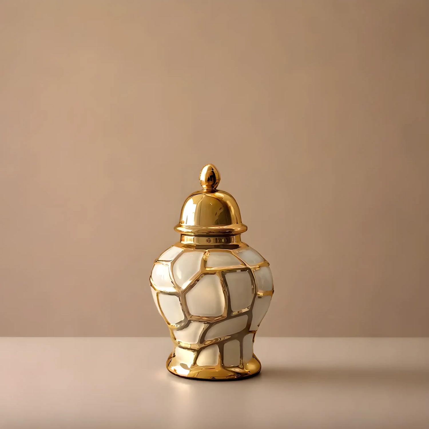
- Vases and vessels: Grouped in odd numbers, varying heights, and complementary tones, vases are one of the most versatile accent pieces in any palette.
- Soft furnishings: Cushions, throws, and rugs from the comforts collection allow you to introduce texture and secondary colours without major commitment.
- Wall art: A well-chosen print or canvas from the wall arts collection can anchor a room's colour story and serve as the starting point for your entire palette.
- Tableware and styling objects: Trays, bowls, and decorative tableware from the tablewares collection add a layer of considered detail to dining and living spaces.
Step 5: Edit and Refine
One of the most common mistakes in interior styling is adding too much. A cohesive palette is as much about what you leave out as what you include. Once you have assembled your pieces, step back and assess. Does anything feel out of place? Is there one colour that appears only once and creates a visual interruption? Remove it, or find a way to echo it elsewhere.
Editing is an ongoing process. As you live in your space, you will naturally notice what feels right and what does not. Trust that instinct — it is usually correct.
Maintaining Cohesion Across Rooms
In open-plan homes — which are common in Dubai's modern residential developments — visual cohesion between spaces is especially important. When one room flows into another, the palette needs to transition gracefully.
A practical approach is to keep the neutral base consistent throughout and allow the accent colours to shift slightly from room to room. For example, the living area might lean into warm sage and terracotta, while the dining area introduces a deeper olive and antique brass — related tones that feel connected without being identical.
Repeating a key material, such as a particular finish of ceramic or a consistent wood tone, also helps unify spaces that are visually connected.
Frequently Asked Questions
How many colours should be in a home decor palette?
Most designers recommend three to five colours: one dominant neutral, one or two secondary tones, and one or two accent colours. Keeping the palette focused makes it easier to shop for new pieces and ensures the space always feels intentional.
Can I mix warm and cool tones in the same palette?
Yes, but with care. A small amount of contrast between warm and cool can add sophistication. The key is to ensure one temperature dominates — typically warm tones work well in UAE interiors given the natural light — and the other appears as a considered accent rather than a competing force.
How do I know if my palette is cohesive?
A simple test: photograph the room in natural light and look at the image on your phone. The camera flattens the space and makes it easier to see whether the colours and materials feel unified or disjointed. If something stands out as jarring in the photo, it will likely feel the same in person.
Where should I start if I am decorating from scratch?
Start with one piece you love — a rug, a piece of wall art, or a set of vases — and build your palette outward from the colours and materials in that piece. This approach ensures your palette has an emotional anchor, not just a logical one.
Building a cohesive home decor palette takes patience, but the result — a home that feels calm, considered, and entirely your own — is well worth the effort. Explore the Harmonia collections to find pieces that speak to your palette and bring your vision to life.

Leave a comment
This site is protected by hCaptcha and the hCaptcha Privacy Policy and Terms of Service apply.